
 KD: It’s my pleasure to have cover designer and erotic author Willsin Rowe on my site today to talk about designing book covers. Welcome, Willsin! I’m so excited to have you here on A Hopeful Romantic, especially since I know you are going to be shedding light on that greatest of all mysteries which plagues both writers and readers. THE BOOK COVER! Could you start by telling us a bit about the multi-talented Willsin Rowe and how you got into book cover design.
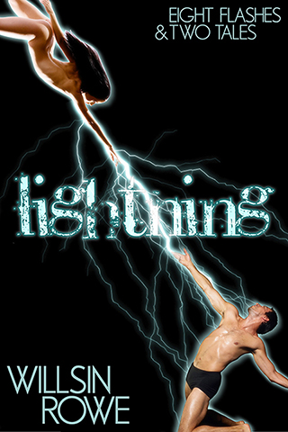
WR: I first took a stab at writing erotica in late 2005. I entered a contest from a small publisher called Aphrodite Unlaced, and was fortunate enough to win. That publisher folded in early 2008, but I well and truly had “the bug” by then! I managed to turn out a couple of stories that were picked up at Excessica, which was still a pretty new endeavour. At that time, Excessica ran as an “author collective”, meaning any extra skills authors could bring to the table were well appreciated. I’d been working in graphic design and page layout for about 20 years at that time, so I put my hand up to try cover art, and I seemed to have some measure of ability at it. (shown throughout this post are some of Willsin’s favourite covers that he has designed)
KD: A question I know readers and writers all want to know the answer to is who actually chooses the book cover designs? How much input does the writer get if any?
WR: I work both as a “solo artist” and also with a publisher, Novel Concept Publishing. I’ve also made covers for Red Phoenix and for Secret Cravings (in both cases it was for anthologies to which I was contributing a story). For the solo stuff, the author always has final approval since it’s their baby, and I’m in their employ for the duration of the work. I certainly make suggestions and point out difficulties where I see them, but in all cases the author gives the final approval. In the work I do with publishers, the author has a large measure of input, but the editorial team also guide the process (and do a dandy job of it, I must say!)
 KD: How much do you have to know about a book before you design the cover? Do you actually read every book?
WR: Oh, no…I’m such a slow reader. I have never been able to allow myself to skip sections, or even to skim, so I read every word. For that reason I couldn’t afford the time to read every book I make a cover for. Essentially, I work from a book blurb if one is available. I do have a form that I send to clients, which covers both tangible and intangible elements. Character descriptions and time period, for instance, as well as mood and feel. From the information within, I often get a clear “story” for a cover. And sometimes authors have a strong and clear vision going into the project. It’s not always a workable vision, of course, because of the inherent limitations of stock imagery. We’ll find, say, the perfect model but not the right pose, or completely unsuitable clothing. Some elements can be worked around, such as hair colour, skin tone, eye colour. I’ve adjusted clothing at times, too. I once added a bra between a pair of naked breasts and the hands that were cupping them!
KD: Where do you get your inspiration for your fabulous cover designs?
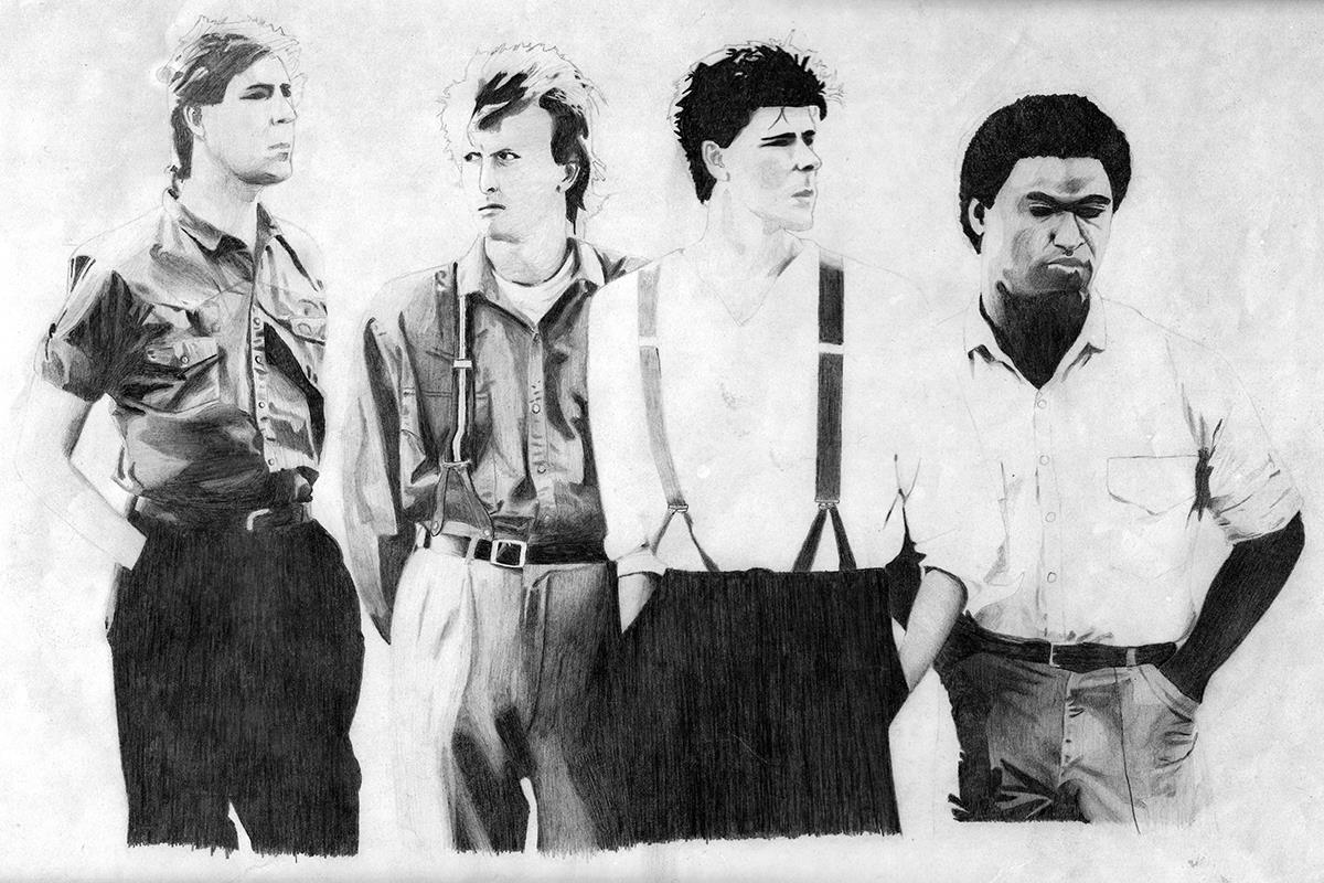
WR: Mostly from the words; the descriptions which the authors provide. Words were my first love, after all! I think creatively in words and music far more than in pictures, and then kind of translate the words into imagery. I don’t actually consider myself particularly creative in a visual sense. I can draw very well in pencil on paper, but only if I’m reproducing an image I’m looking at. For example, here’s a drawing I created in 1986 of my favourite band, Big Country.
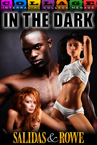
I was very strong in Technical Drawing at high school, and have a strong sense of what I call physical correctness. I strive to keep lighting and toning consistent when combining imagery. If the background scene is lit from the left, then any people or objects I cut out and place in there need to be lit from the left, too. I feel I do false shadows very well. And skin tones. I’ve received many compliments for my skin tones, such as on Selena Kitt’s “Taken” and on my own co-written title, “In The Dark”.

KD: Do you have any contact with the writer during the design process?
WR: A lot of contact. Possibly to an annoying level for the writer! I’ll get them to check out models before I put virtual pen to paper, for example. And we discuss what kind of scenes might work. Covers aren’t always literal, of course. But when they are, they often need to encapsulate large chunks oftime into a single moment.

KD: Could you talk us through the process? How long does it take from start to finish?
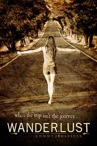
WR: Oh, there’s no one answer to that! My record was something like 9 months! That was at the author’s request, and I wasn’t working constantly on it all the time. There was an enormous gap between finalising the e-book cover and then adapting it to print. Other times, there have been long and complex stories which the author and I have managed to condense to a clear and simple cover in basically a single step. Sommer Marsden is a great one for that kind of cover. She likes them simple, and is far keener on overall feel than intricate details. Selena Kitt also champions feel over fact. That being said, it often happens that a cover which looks simple can have untold intricacies within it. A good example of this would be the Wanderlust cover I made for Sommer Marsden.
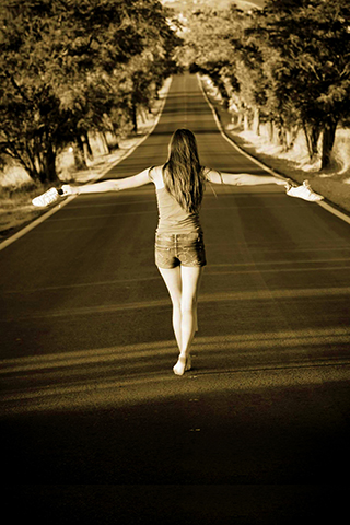
We start with the base image:

It’s a nice image, and a great starting point. The very light sepia tinge is nice, but it wasn’t strong enough to suit the story. So I squeezed in a hint of burnt orange.
I also added some darkness at the bottom of the image to accommodate the titles. But there’s a problem with this image…she has those pesky shoes in her hand. Thanks to the wonderful trickery of Photoshop and its handy cloning tool, hey presto and they’re gone!
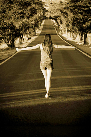
So I’ve coloured the image, created some workable space for text, and stolen her shoes. The next step is to start introducing the titles.

We wanted to go for a font which reflected solidity and fragility at the same time. I loved this font instantly, because it has an inherent strength and crispness, much like Helvetica has. But it has all that subtle and wondrous distressing on it…as if it’s been weathered by time. I loved the visual metaphor of that, considering Really, the female lead in the story, comes from money but feels broken and lost. Sommer herself always – and I mean always – likes to keep her name small. She’s all about the story. So I made her name a little weathered, a little wraith-like…and, of course, little.

Then I added a graphic element to help indicate movement, travel, direction…all that stuff! I went for arrows to suggest compass points and motion, and I weathered them to keep with the theme.
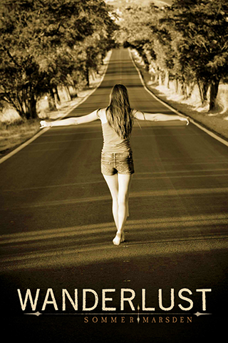
Then there was the all-important tag line. Again, following the theme of weathered and wraith-like. Plus the break in the middle where I split the level just adds to the feel of displacement. But while the titles are nice and weathered, the image is still quite clean and crisp. Best we do something about that! And this is what we did…

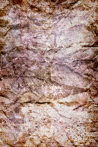
This image of old textured paper was the answer. I took that and overlaid it on the image, which resulted in this:
Finished, right? Well, almost… The only issue to address now is the fact that the young woman just doesn’t quite leap out at us the way she should. And we got around that by adding darkness to the trees. Like so:

So there you have it! The story of a relatively simple cover. If memory serves, that took about three days from go to whoa. Of course, part of that was the fact that I’m in Australia and Sommer’s in the USA. Time zone issues obviously mean that there are plenty of waking hours for me that are sleeping hours for her…and vice versa. In total I think it was about four hours work.
KD: How has the fact that you are also a fiction writer affected your work asa cover designer? How has the fact you’re a cover designer affected your writing?
WR: Being a writer allows me to see “the other side”. I believe I tread quite gently with cover art, and that I listen quite well (for a man!) And it truly helps me to create visual metaphors, and to see a story in a static image. As for how designing affects writing? Well, one way is that being a cover artist means I have less time for writing. That’s not a major factor, though, since I don’t have an Evil Day Job any more. And the positive effect of cover creation is that it pokes parts of my brain which writing doesn’t, and it creates mental links which might otherwise not be there. Like the old “pat your head and rub your tummy” exercise. It makes my brain more flexible, and open to unusual ideas. (Plus I get to scan stock sites for hot chicks and call it “work”!)
KD: Tell us a little bit about Willsin Rowe, the writer. What are you working on now?
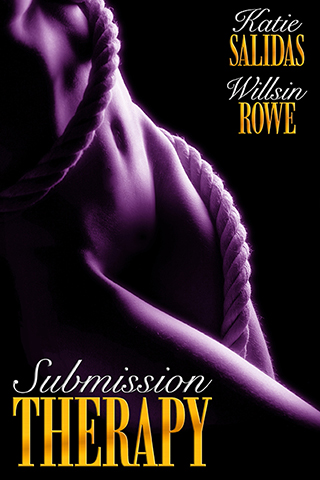 WR: I’m in the early stages of breaking in a new pen name for some stories which just don’t suit Willsin Rowe. I’ve been co-writing with a friend in the US, Katie Salidas, for nigh on a year. We have a three-part series called “Consummate Therapy”, which has taken the idea of Billionaire BDSM and given it a small but interesting twist – we have a female billionaire who needs to learn the art of submission! (By the way, book one in the series, “Submission Therapy” is FREE!)
We also have a series of ménage stories we’re currently working on. Katie also writes a lot of vampire fiction, both erotic and urban fantasy and she’s inspired me to take the plunge in that field as well. So I’m also putting the finishing touches to my first ever vampire erotica. Well, it’s more an erotic romance, truly.
KD: And what is Willsin Rowe, the cover designer working on now?
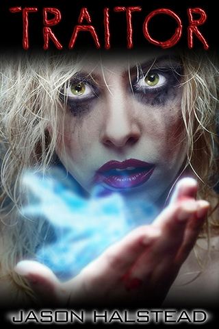
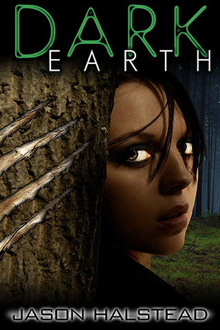
WR: Oh, I generally have anything from 4-10 covers going at any one time. I recently finished a set of nine Selena Kitt covers, for her upcoming Modern Wicked Fairy Tales. I’ve also done a stack of covers for Jason Halstead, whose work rolls easily between sci-fi, fantasy, thriller and adventure. Jason’s the best kind of problem client, too…he packs an enormous amount of action into each story, so it becomes quite difficult to narrow down exactly what we’ll put on his cover! That’s a nice problem for a cover designer. And currently I’m putting all the little finishing touches on a cover for a relatively new Aussie author, Lotta Bangs. She’s written so many stories, though, that she actually has two artists creating covers for her! While her covers often look reasonably simple, they actually push me pretty hard.
 KD: What’s the best part about being a cover designer? The worst?
WR: It’s a bit soppy, I suppose, but the best part is the networking. I’ve met so many folk through cover art and I strongly doubt I’d have met most of them otherwise. It’s made me some friends, given me contacts and allowed me to expand my global empire! The worst part…well, it’s something that happens only on odd occasions. It’s when a cover just refuses to come together. Sometimes I come up with a concept that I’m sure will work, but I just can’t find imagery to suit it. Other times, it’s almost the opposite: I’ll have the right woman, the right man, the right background…and they just don’t fit together. Making a cover that ends up completely wrong actually takes just as much time as getting it right!
KD: What does Willsin Rowe do for entertainment when not designing covers or writing hot fiction?
WR: My main entertainment pursuit is actually the third string to my bow. I play bass in a swampy blues/rock/folk/country band called The Medicine Show. I use another alias for that project, though: Burnin’ Log Dawkins. I also design most of our posters and CD artwork, and I created a few music videos for us as well. We had a couple of songs on iTunes in 2011-12, but circumstances with our distributor changed and we felt the need to step back from all of that. We’re in the process of building ourselves up in a new direction, including a travelling show that harks back to the old days of Vaudeville.
KD: What are some of your favourite covers you’ve created?
WR: There are so many! I’m closing in on 250 covers created. But for various reasons (sometimes simplicity, sometimes complexity, sometimes just the “secret cover artists’ business” that makes intricacy look simple), these are an assortment of my favourites. (also see above)

About Willsin Rowe
Willsin Rowe falls in love with a scent, a playful expression or an act of casual intimacy more easily than with physical beauty. When confronted by any combination of those elements he is a lost cause. He has done many things over and over, done even more things only once, and half-done more things than he cares to admit. He loves to sing and doesn’t let his voice get in the way. He is intelligent but not sensible. He is passionate but fearful. He is not scruffy enough or stylish enough to be cool.
Blog: http://willsinrowe.blogspot.com.au/
Facebook: https://www.facebook.com/willsin.rowe
Thank you so much for the opportunity to blather on for so long, KD! It was a whole bunch of fun.
Thank YOU for stopping by, Willsin! It was a total pleasure to have you! I had fun too, and learned a lot!
Great interview! Great examples! I still love the modifications you did on the base image for Jeremy Edwards’ Private Fountains series–and how the floor tiles reflect the new colors of the shoes… Good stuff.
Wonderful post Willsin and KD!
I especially love the step by step of Sommer’s “Wanderlust”, which did not know was Willsin’s design. I’ve loved that cover from the moment I saw it!
As an amateur PS designer myself, i enjoyed this post immensely.
Great work!
~Rose Caraway